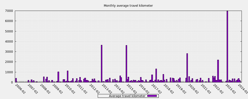
I love how my "Historic hit travel kilometer" chart (on the page "Hit Summary", area 901: hit summary charts) has been showing a steadily declining average travel distance in the past months. Arguably that might be related to the pandemics: the less we are able to travel, the less banknotes will travel.
So, here are my two requests:
- A user0 (combining all users) chart for that ("Historic hit travel kilometer").
- A monthly bar chart showing the monthly average travel distance (which wouldn't be useful for single users, except for the very heavy-duty ones, but is probably a great bonus for the combination of all users).
These charts might be a good way to call the attention of media agencies to EBT.