New Spanish serie of coins in 2010

New Spanish serie of coins in 2010
http://www.pulifil.es/" onclick="window.open(this.href);return false;
European soul, European pride.
-
androl

- Euro-Master

- Posts: 4318
- Joined: Sun Feb 08, 2004 1:20 pm
- Location: München (Myeenack, Mjuncken), Deutschland (Chairmany, Djutschländ)
- Contact:
Re: New Spanish serie of coins in 2010
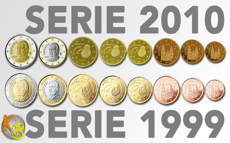
hmm, the only thing they do is put away these panels with inverse stars and writing
this will make the 1€ and 2€ coins look somehow different, I even think better, but at the cent coins you don't really realize the change
... now I see they also move the "M" and the year to different positions, but only on the 1€ and 2€
Joshu, a Chinese Zen master, asked a cow:
"Do you have Buddha-nature or not?"
The cow answered: "Moo."
"Do you have Buddha-nature or not?"
The cow answered: "Moo."
-
Jes

- Euro-Master
- Posts: 4933
- Joined: Thu May 24, 2007 9:38 pm
- Location: Away from home (once again)
- Contact:
Re: New Spanish serie of coins in 2010
I like the now design for the 1€ and 2€ coins. But I dislike the new 'red' coins  For the 'yellow' coins, the variation is so light that I don't mind at all.
Anyway, we will see next year
For the 'yellow' coins, the variation is so light that I don't mind at all.Anyway, we will see next year
Jes Speaks English, French, Spanish, Tokpisin and Esperanto. (Currently learning Swahili).
Don't fear perfection, you'll never reach it! (by Salvador Dali)
my EBT: http://es.eurobilltracker.com/profile/?user=121292" coins and banknote collector.
Don't fear perfection, you'll never reach it! (by Salvador Dali)
my EBT: http://es.eurobilltracker.com/profile/?user=121292" coins and banknote collector.
-
Al s'é pers

- Euro-Master
- Posts: 1186
- Joined: Tue Nov 25, 2008 2:13 pm
- Location: Alseno (PC) vs. San Giovanni in Persiceto (BO)
- Contact:
Re: New Spanish serie of coins in 2010
This is because Spanish had a strict interpretation of the 4th article in the 2009-12-19 EU Commission recommendation (on common guidelines for the national sides and the issuance of euro coins intended for circulation):androl wrote: hmm, the only thing they do is put away these panels with inverse stars and writing
this will make the 1€ and 2€ coins look somehow different, I even think better, but at the cent coins you don't really realize the change
... now I see they also move the "M" and the year to different positions, but only on the 1€ and 2€
This means that not only German, Greek and Austrian coins, who doesn't report any indication of their issuing country, has to change like already done by Finnish and Belgian coins, but even Luxembourgish, Slovenian and Dutch should change, and even Monaco. And what about French design? The stars doesn't "fully" surround the national side neither there (and in the 1 and 2 € coins the year is written in the circle)..."The national side of the euro coins intended for circulation should bear the 12 European stars that should fully surround the national design, including the year mark and the indication of the issuing Member State's name. The European stars should be depicted as on the European flag."
Mé a'm sån pers, te t'i pers, ló al s'é pers
Me am sum pers, te't t'é pers, lü al s'é pers
EBT profile | EBTST stats >> Situation @ 31-05-13 : +32.000 notes = 56 hits <<
Me am sum pers, te't t'é pers, lü al s'é pers
EBT profile | EBTST stats >> Situation @ 31-05-13 : +32.000 notes = 56 hits <<
Re: New Spanish serie of coins in 2010
Extremely strict indeed. After all, the Commission recommendation (December 2008) and the Council conclusion (February 2009) specifically say that "No changes are required to the national sides and edge letterings of both regular and commemorative euro coins intended for circulation which have been first issued or approved according to the agreed information procedure prior to the adoption of these conclusions."Al s'é pers wrote:This is because Spanish had a strict interpretation of the 4th article in the 2009-12-19 EU Commission recommendation (on common guidelines for the national sides and the issuance of euro coins intended for circulation)
As for the other countries you mentioned, well, Germany has already decided that the €2 commems will have a "D" as from next year (no changes to the circulation coins though); with Austria you always have the flag (don't know if that counts as a country identifier, and on new issues they would have to remove the face value from the national sides anyway). The coins from Monaco are fine; they do comply with this recommendation. The others ... well, yes, if the "ring" may not show anything except the circle of stars, some more designs would have to be modified. But again - no changes required, see above.
And fortunately so, I think - this new rule makes the area that can be used for the actual design very small ...Christian
-
Dakkus

- Euro-Master
- Posts: 4734
- Joined: Tue Jun 24, 2003 3:59 pm
- Location: No Helsinkiem, Somijas / Iš Helsinkio, Suomijos
- Contact:
Re: New Spanish serie of coins in 2010
I would argue that as long as no part of the national design is further than the outermost parts of the stars, the stars still surround the design. if a piece of the national design has a star on its left side and on its right side, then it is clearly surrounded by the stars.
I'd understand the main idea is to make it impossible deawing a really tiny ring of stars in some place where nobody can notice it.
The Dutch half-circle, though .... And to a smaller extent, the French design.
But once again, designs older than the rule, so no change required.
I'd understand the main idea is to make it impossible deawing a really tiny ring of stars in some place where nobody can notice it.
The Dutch half-circle, though .... And to a smaller extent, the French design.
But once again, designs older than the rule, so no change required.
Ko saka āboliņš? Pēk pēk pēk!

Re: New Spanish serie of coins in 2010
My opinion is based on a wish for a bit stricter graphic conformity on the national sides.
The graphic definition for the common side is cleary very exact: each coin denomination must be exactly similar in every eurozone country. The definition for each coin is certainly represented by technical drawings and other desrciptions like measurements of the relief depth of the patterns etc.
But the national side definition seems to be much more open. I think that only the width of the thin ring edge around the national side is technically defined, to be the same as its width on the common side. Everything else seems to be rather loosely defined only by the verbal guidelines above.
My opinion is that the national side should originally have been defined so that in addition to the ring edge, also the EU stars ring had been represented by exact drawings and were common to all countries, in other words not subject to any national variation. So only the area inside the innermost tips of the stars (with a certain margin of a few hundredths of a millimetre so that the stars didn't touch other patterns) should have been subject for the national designs. Imagine this as a common exactly drawn frame with the stars on the national side with an empty space in the middle for national use. The verbal definition should only give the guidelines for filling the empty space.
The existing verbal definition doesn't say it quite explicitly, but the words "The European stars should be depicted as on the European flag" actually imply that the stars should be not only in a circular constellation but also in the same orientation (standing on two of their tips, one tip pointing up), having a certain size which is proportional to the circle diameter, etc. For example, the original Spanish design with the inversion boxes would have been avoided if the star ring had been defined as common, right from the start.
I think that a common graphic definition for the star ring would have created a more aestethically pleasing series of coins originally, even if it had of course significantly restricted the usable area for the national motif.
There could have been another alternative: no requirement at all for the stars on the national side, since the common side already contains the stars (though not as a full circle, and except on the 1-5 cent coins). Had it been so, the area for the national designs could have been maximized. I have always thought that there are a bit too many stars on the euro coins, and thus the coins would have done better without any stars on the national sides at all. This is of course my opinion only .
The graphic definition for the common side is cleary very exact: each coin denomination must be exactly similar in every eurozone country. The definition for each coin is certainly represented by technical drawings and other desrciptions like measurements of the relief depth of the patterns etc.
But the national side definition seems to be much more open. I think that only the width of the thin ring edge around the national side is technically defined, to be the same as its width on the common side. Everything else seems to be rather loosely defined only by the verbal guidelines above.
My opinion is that the national side should originally have been defined so that in addition to the ring edge, also the EU stars ring had been represented by exact drawings and were common to all countries, in other words not subject to any national variation. So only the area inside the innermost tips of the stars (with a certain margin of a few hundredths of a millimetre so that the stars didn't touch other patterns) should have been subject for the national designs. Imagine this as a common exactly drawn frame with the stars on the national side with an empty space in the middle for national use. The verbal definition should only give the guidelines for filling the empty space.
The existing verbal definition doesn't say it quite explicitly, but the words "The European stars should be depicted as on the European flag" actually imply that the stars should be not only in a circular constellation but also in the same orientation (standing on two of their tips, one tip pointing up), having a certain size which is proportional to the circle diameter, etc. For example, the original Spanish design with the inversion boxes would have been avoided if the star ring had been defined as common, right from the start.
I think that a common graphic definition for the star ring would have created a more aestethically pleasing series of coins originally, even if it had of course significantly restricted the usable area for the national motif.
There could have been another alternative: no requirement at all for the stars on the national side, since the common side already contains the stars (though not as a full circle, and except on the 1-5 cent coins). Had it been so, the area for the national designs could have been maximized. I have always thought that there are a bit too many stars on the euro coins, and thus the coins would have done better without any stars on the national sides at all. This is of course my opinion only
.-
androl
- Euro-Master
- Posts: 4318
- Joined: Sun Feb 08, 2004 1:20 pm
- Location: München (Myeenack, Mjuncken), Deutschland (Chairmany, Djutschländ)
- Contact:
Re: New Spanish serie of coins in 2010
this has been done on all national designs, but there are some few German coins where the stars have turning orientation, where one tip is pointing out of the circle and two are pointing to the inner part. This has been a fault of the designer and was found out when the first minted coins were showed to the public in 1998, then all the coins had to be melted and new coins had to be madeCraft wrote:"The European stars should be depicted as on the European flag" actually imply that the stars should be not only in a circular constellation but also in the same orientation (standing on two of their tips, one tip pointing up),
http://de.wikipedia.org/wiki/Drehende_Sterne" onclick="window.open(this.href);return false;
http://cgi.ebay.de/ws/eBayISAPI.dll?Vie ... 0457233519" onclick="window.open(this.href);return false; someone paid 1135 euros for such a coin

Joshu, a Chinese Zen master, asked a cow:
"Do you have Buddha-nature or not?"
The cow answered: "Moo."
"Do you have Buddha-nature or not?"
The cow answered: "Moo."
Re: New Spanish serie of coins in 2010
That's funny, and I didn't know about that incident beforeandrol wrote:there are some few German coins where the stars have turning orientation, where one tip is pointing out of the circle and two are pointing to the inner part. This has been a fault of the designer and was found out when the first minted coins were showed to the public in 1998, then all the coins had to be melted and new coins had to be made
That wikipage shows both the correct and an incorrect version of the EU flag. When I look at them as a whole (squeezing my eyes a little), the incorrect one actually seems graphically more pleasing to the eye than the correct oneandrol wrote:http://de.wikipedia.org/wiki/Drehende_Sterne
, since the ring of stars is perfectly balanced when one tip is always pointing directly out from the centre.Re: New Spanish serie of coins in 2010
That is because the Stuttgart (F) variety is the least expensive one among those pieces.androl wrote:http://cgi.ebay.de/ws/eBayISAPI.dll?Vie ... 0457233519 someone paid 1135 euros for such a coin
 Hamburg (J) is about twice that price ...
Christian